The thoughtful and practical lifestyle shift that has occurred is not transitory but has become instinctive. A mass re-prioritizing and re-assessment of values, purpose and systems at large has occurred. Many have realized we can do more with less, and we see this reflected in manufacturing with the rise in popularity of reductive design. Impact receipts, a new focus on traceability, and furthering the use of partnerships with transparent tech companies are all great indicators that brands too are doing things differently. Companies have noticed us living with more intention, and the most successful ones will be those who share theirs. A more sensible approach to fashion and styling emerges, while still being innovative and inspired.
PANTONE® 19-0912
PANTONE 16-1345
PANTONE 13-5309
PANTONE 14-0223
PANTONE 18-3714
PANTONE 14-4104
PANTONE 11-0620
Pantone, Inc. has provided a color reference for each yarn color, when possible, which represents the closest available PANTONE® for fashion and home color (a component of the PANTONE Textile Color System®), viewing the colors under daylight (6500º K). Color appearance will vary based on lighting conditions and angle of view. PANTONE Colors displayed here may not match PANTONE-identified standards. Consult current PANTONE for fashion and home publications for accurate color. PANTONE® and other Pantone, Inc. trademarks are the property of Pantone, Inc. Portions © Pantone, Inc., 2022 Produced with the permission of Pantone, Inc.
- This palette exudes a calm confidence
- Deliberate use of color where each shade has purpose
- Earthy sunbaked hues, powder blue, sage green, and enlightened yellow
- Deep greyed purple is a new and unique neutral with wide appeal
- Soothing, repetitive patterns and textures in monochromatic colorways lend a sense of stability
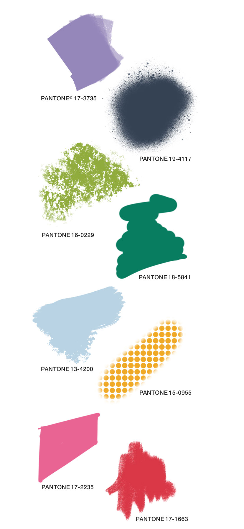
A celebration of the journey: be it that of a true voyage to a new or different destination or the one that is life itself. Both versions provide us rich and diverse personal stories to share. We are currently living in the time of the great migration, the urban exodus, and the outdoor-boom. This is providing us all with a sense of flexibility not only of location but also of personal development; allowing us to explore our multi-hyphenated existences. We are willing more than ever to travel a great distance for a specific experience valuing both the process of getting there as much as the destination. Modern day artisans embrace their multi-cultural identities adding layers of complexity and curiosity to their work.
PANTONE® 18-1553
PANTONE 19-1617
PANTONE 16-1529
PANTONE 18-1354
PANTONE 19-5917
PANTONE 18-4250
PANTONE 18-1112
Pantone, Inc. has provided a color reference for each yarn color, when possible, which represents the closest available PANTONE® for fashion and home color (a component of the PANTONE Textile Color System®), viewing the colors under daylight (6500º K). Color appearance will vary based on lighting conditions and angle of view. PANTONE Colors displayed here may not match PANTONE-identified standards. Consult current PANTONE for fashion and home publications for accurate color. PANTONE® and other Pantone, Inc. trademarks are the property of Pantone, Inc. Portions © Pantone, Inc., 2022 Produced with the permission of Pantone, Inc.
- A tapestry of rich shades that pulse with life and story
- An adventurous and self-expressive combination of colors
- Warm, heated shades of crimson and oxblood glow against the cooler hues
- Heritage motifs with modern flare are applied to unexpected fabrics and styles
We are transported to a time and a place of uncomplicated joy and exuberance. Purposefully ostentatious as drive for fun and whimsy is both therapeutic and inspiring. Collaboration becomes caring and inclusive with major brands shining their spotlight on smaller creatives; the best examples are those sharing their platforms and tools as well. Resourcefulness gets playful with designers crowdsourcing used materials from consumers to make new product. Through stimulating color, unexpected contrasts, and toying with proportion and shape the design effect is happiness inducing. Play On is the antidote to the heaviness of the day-to-day. Its main purpose is to provide joy, levity, and serotonin.
Pantone, Inc. has provided a color reference for each yarn color, when possible, which represents the closest available PANTONE® for fashion and home color (a component of the PANTONE Textile Color System®), viewing the colors under daylight (6500º K). Color appearance will vary based on lighting conditions and angle of view. PANTONE Colors displayed here may not match PANTONE-identified standards. Consult current PANTONE for fashion and home publications for accurate color. PANTONE® and other Pantone, Inc. trademarks are the property of Pantone, Inc. Portions © Pantone, Inc., 2022 Produced with the permission of Pantone, Inc.
- An overtly stimulating collection of color for the Fall/Winter season
- A combination of both retro and memorable shades
- Poignant red and pink are impactful while greens are enhanced and experimental
- Pastel lilac and blue add a whimsical element
- Seasonal favorites get amplified and energized through expressive color and optical motifs
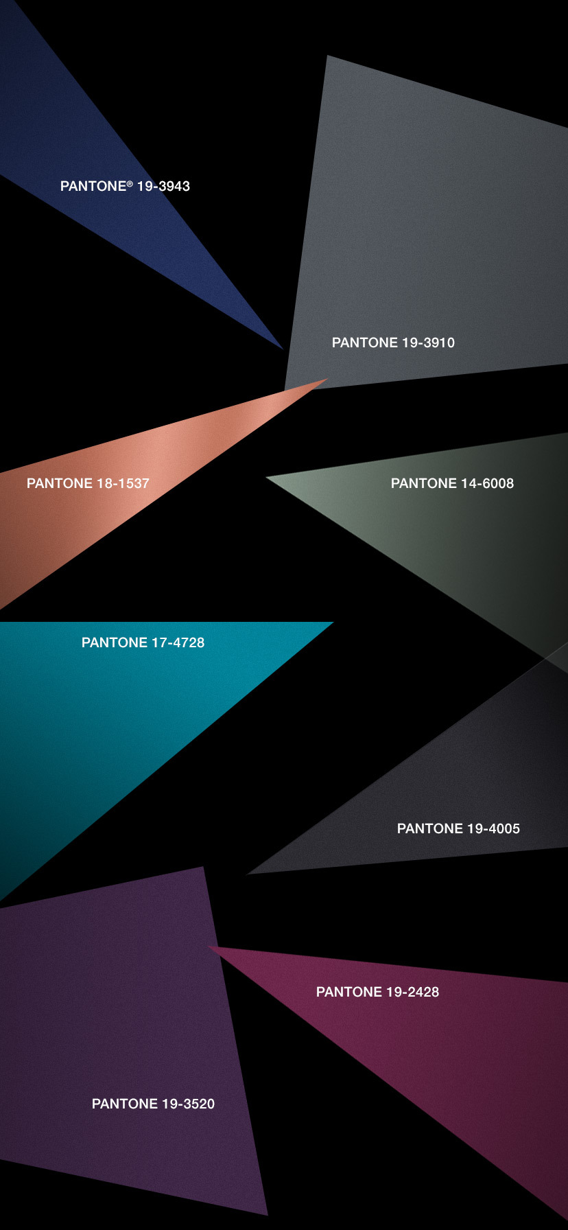
Instead of focusing and obsessing over all we “know,” we shift our perspective to the unknown, not to learn it, but to accept and revel in the fact that we do not. In Spiritual Futurism, we zoom all the way out so far from the presented realities that we cannot even see them, let alone feel the pressures of them. This is liberating. The expansion of virtual worlds frees us from set realities be it physical or mental; similarly, this is also the goal of meditation. We are now entering a time where technology and spirituality are no longer mutually exclusive.
PANTONE® 19-3943
PANTONE 17-4728
PANTONE 19-4005
PANTONE 19-3520
PANTONE 19-2428
PANTONE 14-6008
PANTONE 18-1537
PANTONE 19-3910
Pantone, Inc. has provided a color reference for each yarn color, when possible, which represents the closest available PANTONE® for fashion and home color (a component of the PANTONE Textile Color System®), viewing the colors under daylight (6500º K). Color appearance will vary based on lighting conditions and angle of view. PANTONE Colors displayed here may not match PANTONE-identified standards. Consult current PANTONE for fashion and home publications for accurate color. PANTONE® and other Pantone, Inc. trademarks are the property of Pantone, Inc. Portions © Pantone, Inc., 2022 Produced with the permission of Pantone, Inc.
- Shadowed hues that dissolve and catapult us into a transcendental realm
- Layers of dark black, blue, and purple create an abyss that allow lighter hues of blue and green to give an overall ethereal impression
- Shimmering, metallic copper provides a cosmic luster
- Dimensional sheen and futuristic styling lend a magnetic quality to fabrics and silhouettes
Camouflage patterning is refreshed through flocked finishes on knits and wovens
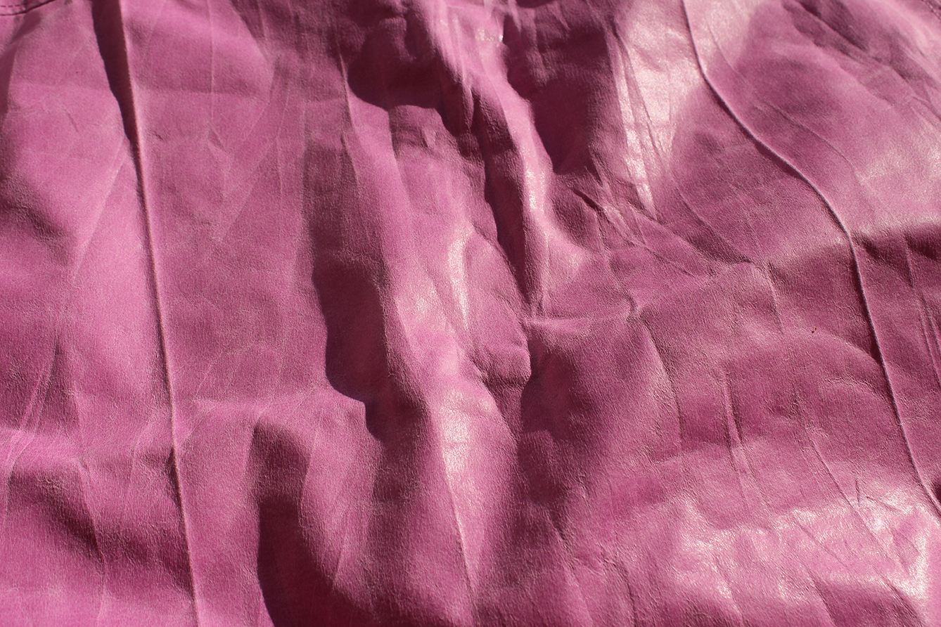
Faux leather coating on a bubblegum pink cotton blend fabric
Honeycomb texture combines with napped back for a cozy update in a sweatshirt silhouette
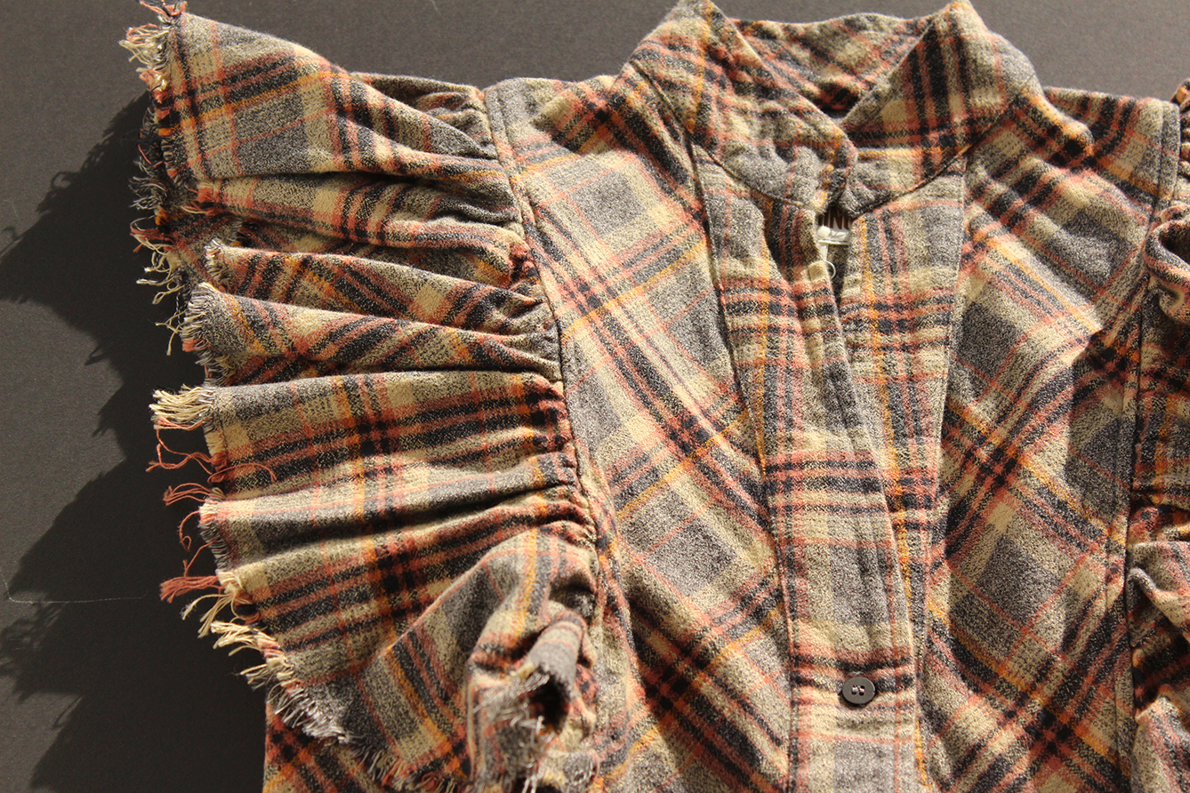
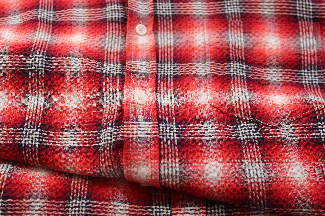
Traditional flannels emerge in dressier womenswear silhouettes for the Fall/Winter season
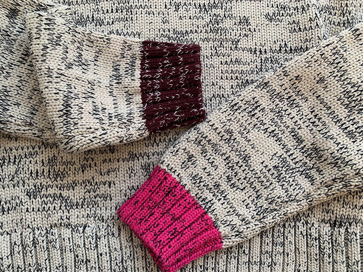
Colorful trim details enliven a mélange cotton blend sweater knit
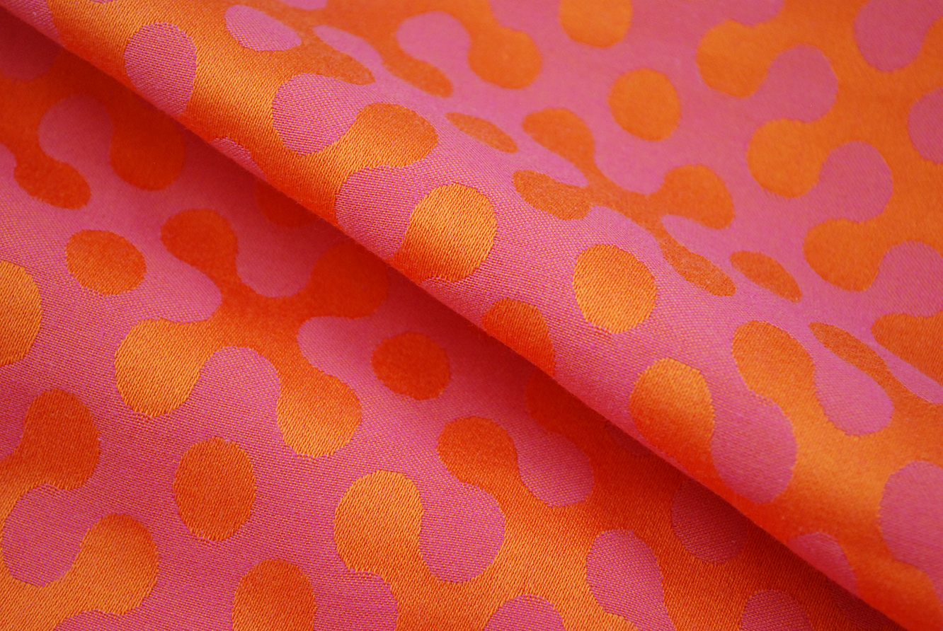
Mercerized orange yarns in a geometric pattern enhance the pink ground of a 100% cotton jacquard woven damask fabric (Cotton Incorporated Product Development #7361)
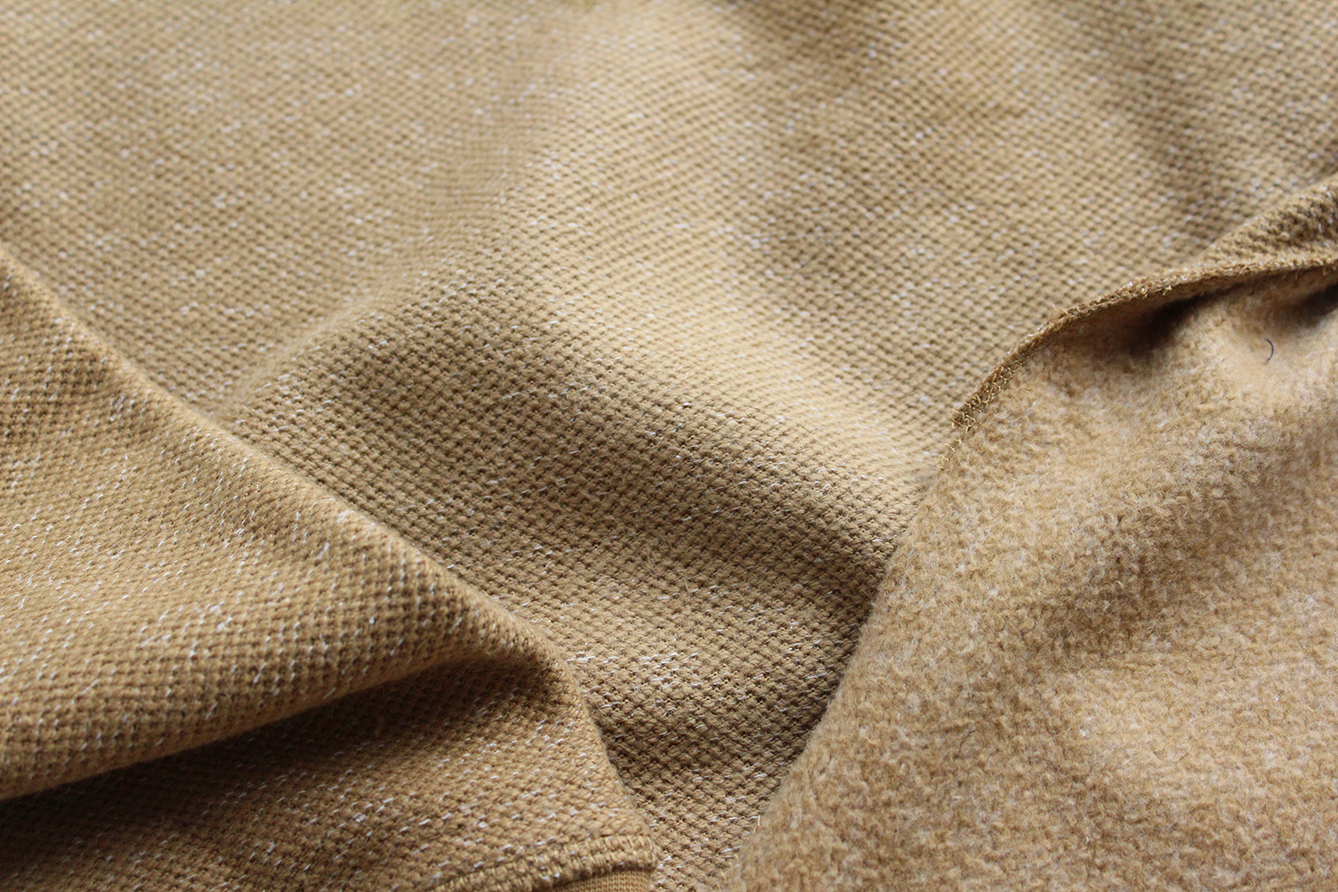
Refined moleskin fabrics in shades of putty have a suede-like appearance
A summer fabric construction and winter pattern collide for the perfect transitional cotton piece
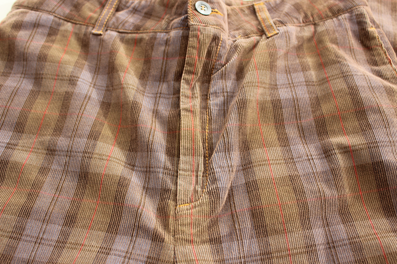
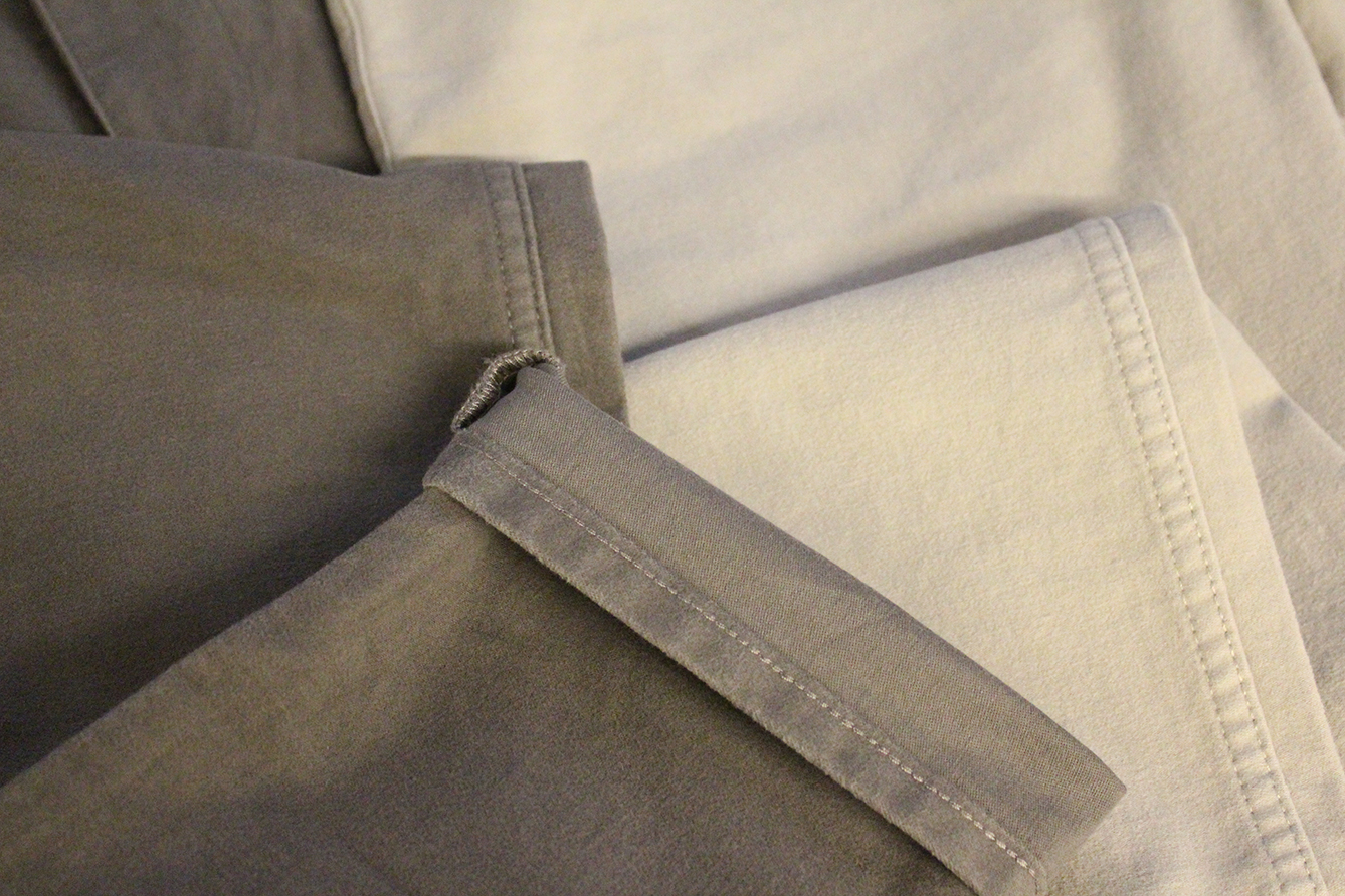
Subtle shadow effect on a lightweight 100% cotton yarn dyed plaid corduroy pant
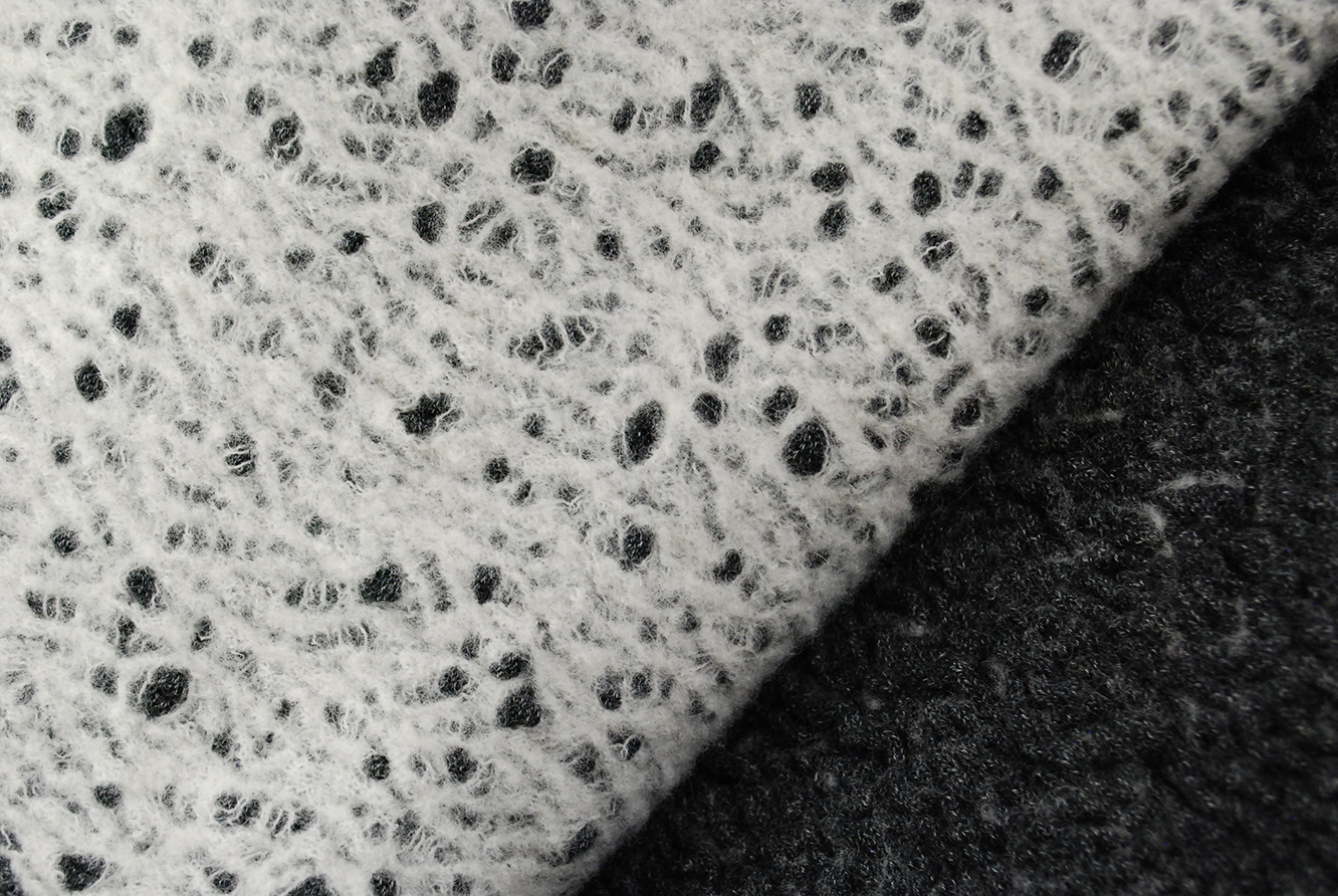
Cotton/wool pointelle doubleface knit with jaspé yarns and an irregular pattern on face (Cotton Incorporated Product Development #FK-1110)
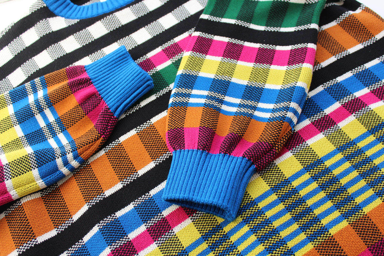
A plaid patterned sweater knit is energized with bright technicolor hues providing an allover optical effect
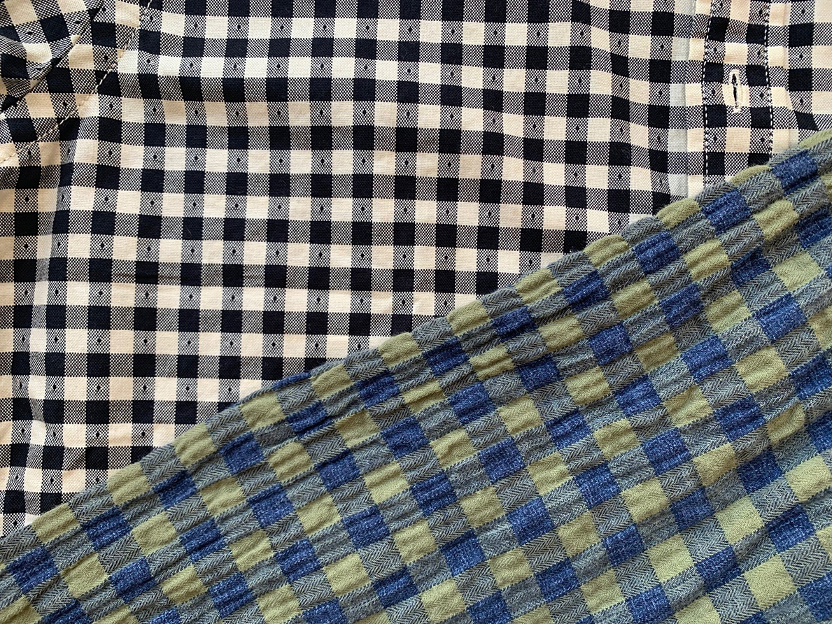
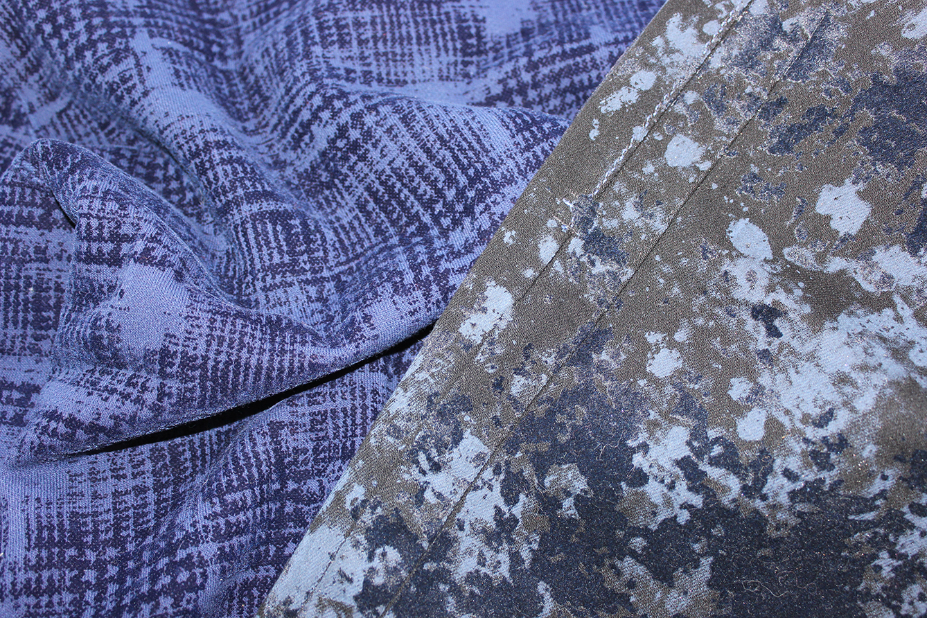
Winter ginghams have become a seasonal shirting staple, ranging from a crisp dobby to a pattern with indigo-inspired streaks
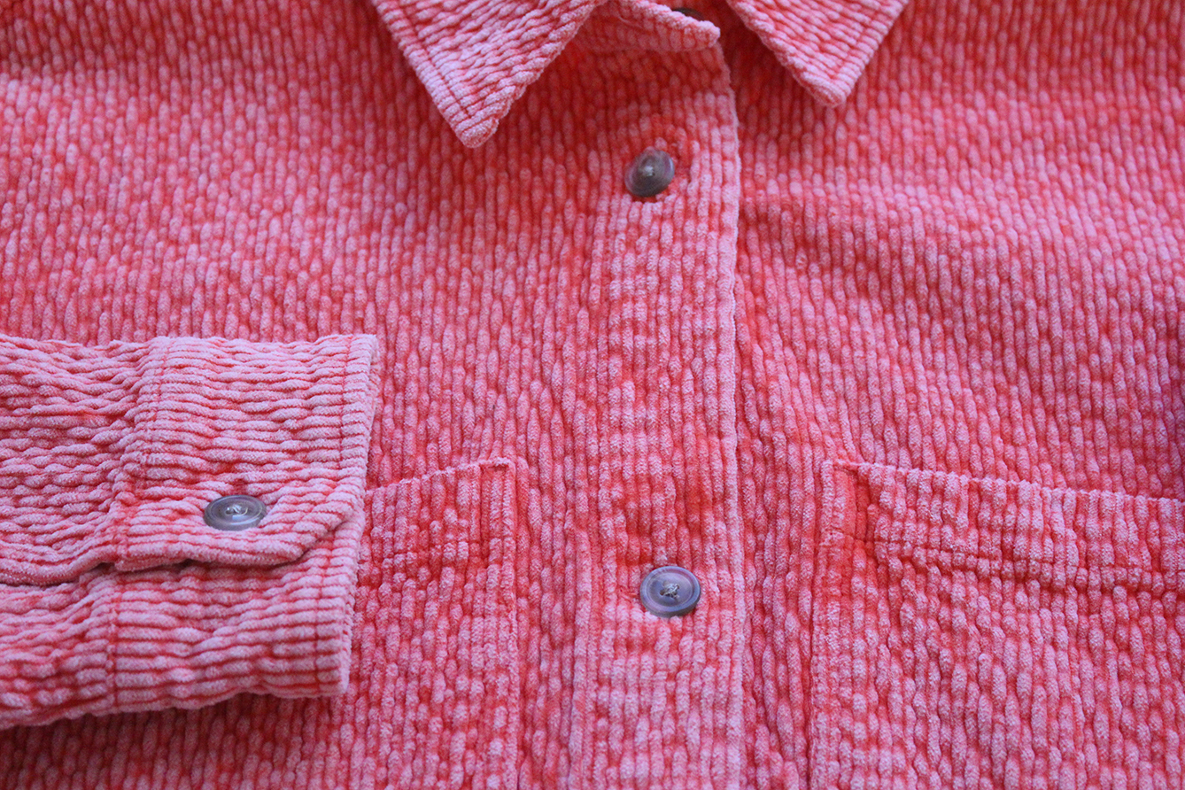
Frosted neon color enhances the sensorial appeal of a hyper-textured corduroy
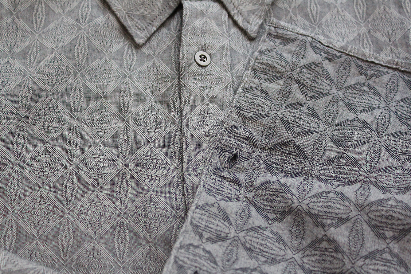
A hypnotizing, oscillating pattern adds movement to a 100% cotton shirting
World Headquarters Cary
6399 Weston Parkway
Cary, North Carolina 27513
Tel 919 678 2220
Fax 919 678 2230
Osaka
Mengyo Kaikan Shinkan 6F
5-8, Bingo-machi 2-chome
Chuo-Ku, Osaka, 541-0051 Japan
Tel +81 6 6223 0100
Fax +81 6 6223 0600
Shanghai
Unit 3709 Plaza 66 Tower 2
1266 Nanjing West Road
Shanghai 200040, China
Tel +86 21 6288 1666
Fax +86 21 6288 3666
Consumer Marketing Headquarters New York
909 Third Avenue, 14th Floor
New York, New York 10022
Tel 212 413 8300
Fax 212 413 8377
Hong Kong
Suite 2007
Tower 6, The Gateway
9 Canton Road
Tsimshatsui, Kowloon
Hong Kong
Tel +852 2175 5321
Fax +852 2175 5110
Mexico City
Av. Insurgentes Sur 1066
Piso 9
Col. Insurgentes San Borja
C.P. 03100
Alcaldía Benito Juárez
Cd de México, México
Tel +52 55 5663-4020
Fax +52 55 5663 40 23
COTTONINC.COM
THEFABRICOFOURLIVES.COM
AMERICA’S COTTON PRODUCERS & IMPORTERS
® The Seal of Cotton is a registered
trademark / servicemark of Cotton Incorporated.
© 2022 Cotton Incorporated. All rights reserved.

Pantone, Inc. has provided a color reference for each yarn color, when possible, which represents the closest available PANTONE® for fashion and home color (a component of the PANTONE Textile Color System®), viewing the colors under daylight (6500º K). Color appearance will vary based on lighting conditions and angle of view. PANTONE Colors displayed here may not match PANTONE-identified standards. Consult current PANTONE for fashion and home publications for accurate color. PANTONE® and other Pantone, Inc. trademarks are the property of Pantone, Inc. Portions © Pantone, Inc., 2022 Produced with the permission of Pantone, Inc.